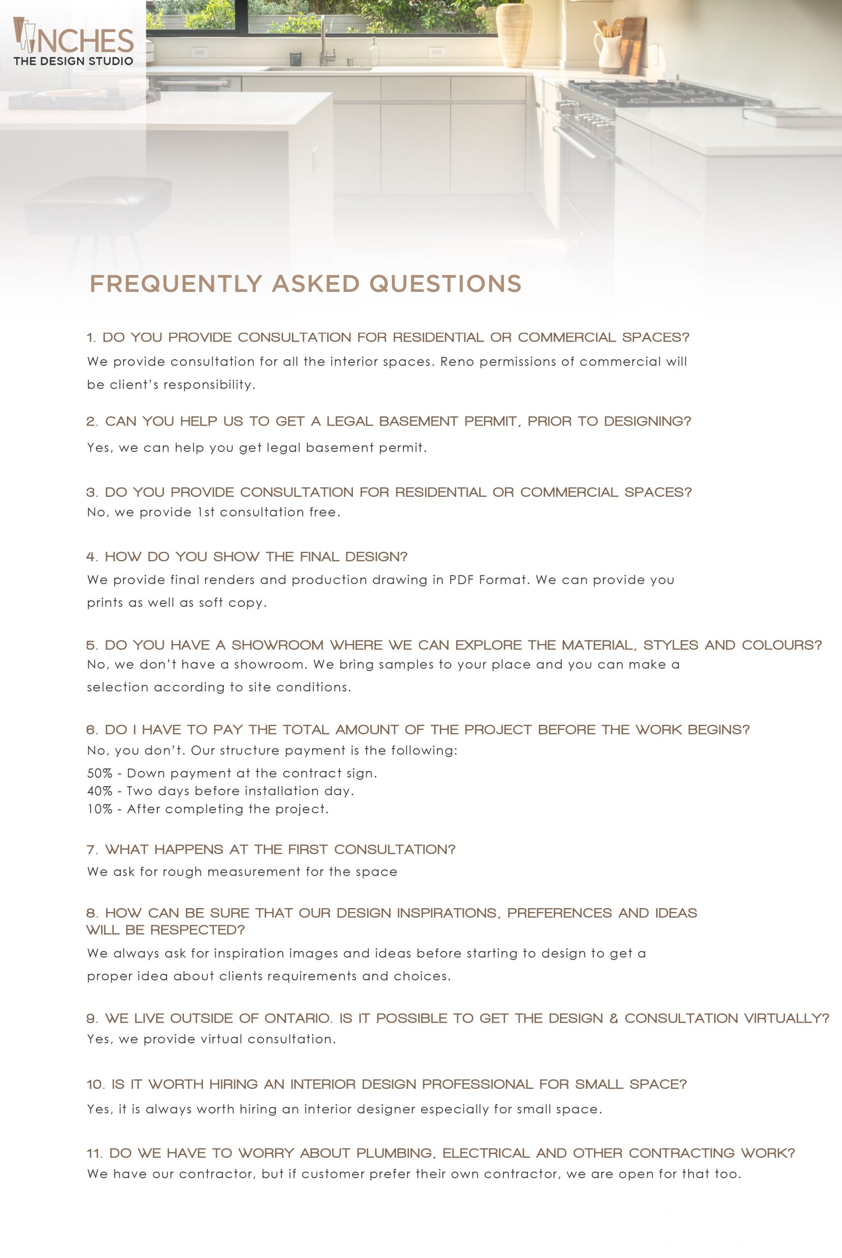
Inches: The Design Studio is a company based in Toronto. The owner, Kanal came from India to make her dream come true, transforming houses into homes. Their main object is to make sure no inch is left behind without design. Always according to the client’s requirements, ideas, and budget.
Their mission is to deliver the best quality and design, even when the budget is tight. They want to show that you don’t need to spend all your savings to get great results.
The company offers services that go from the first consultation to the final installation. They take care of the whole process, including hiring contractors, providing materials, or buying furniture.
General Concept
When we think about architecture or interior design, the first thing that comes to our minds is geometry and symmetry.
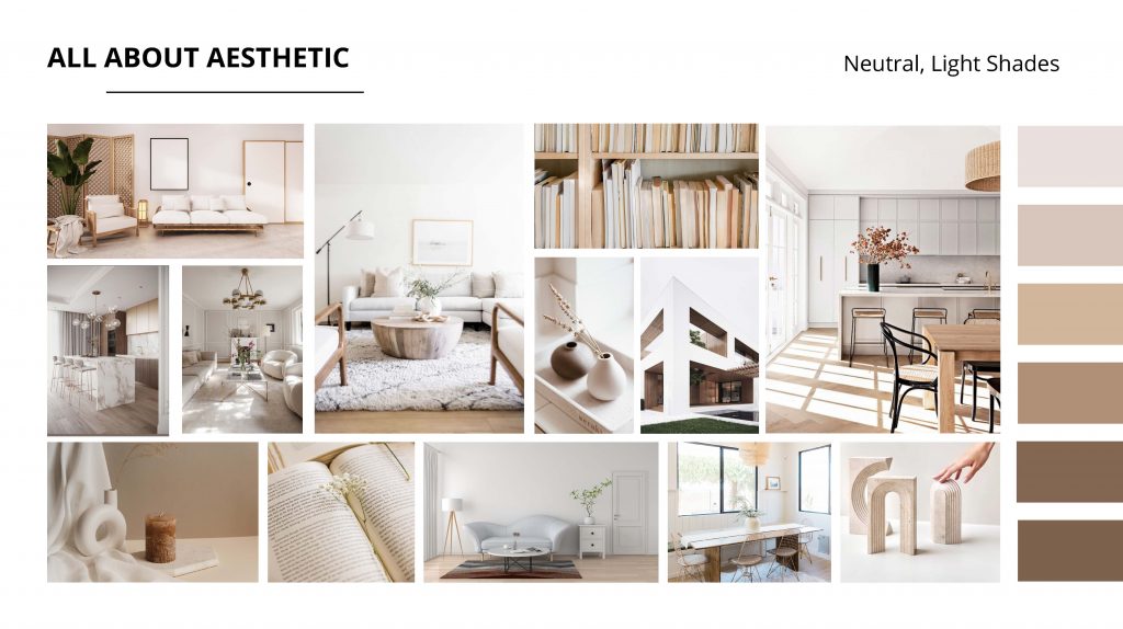
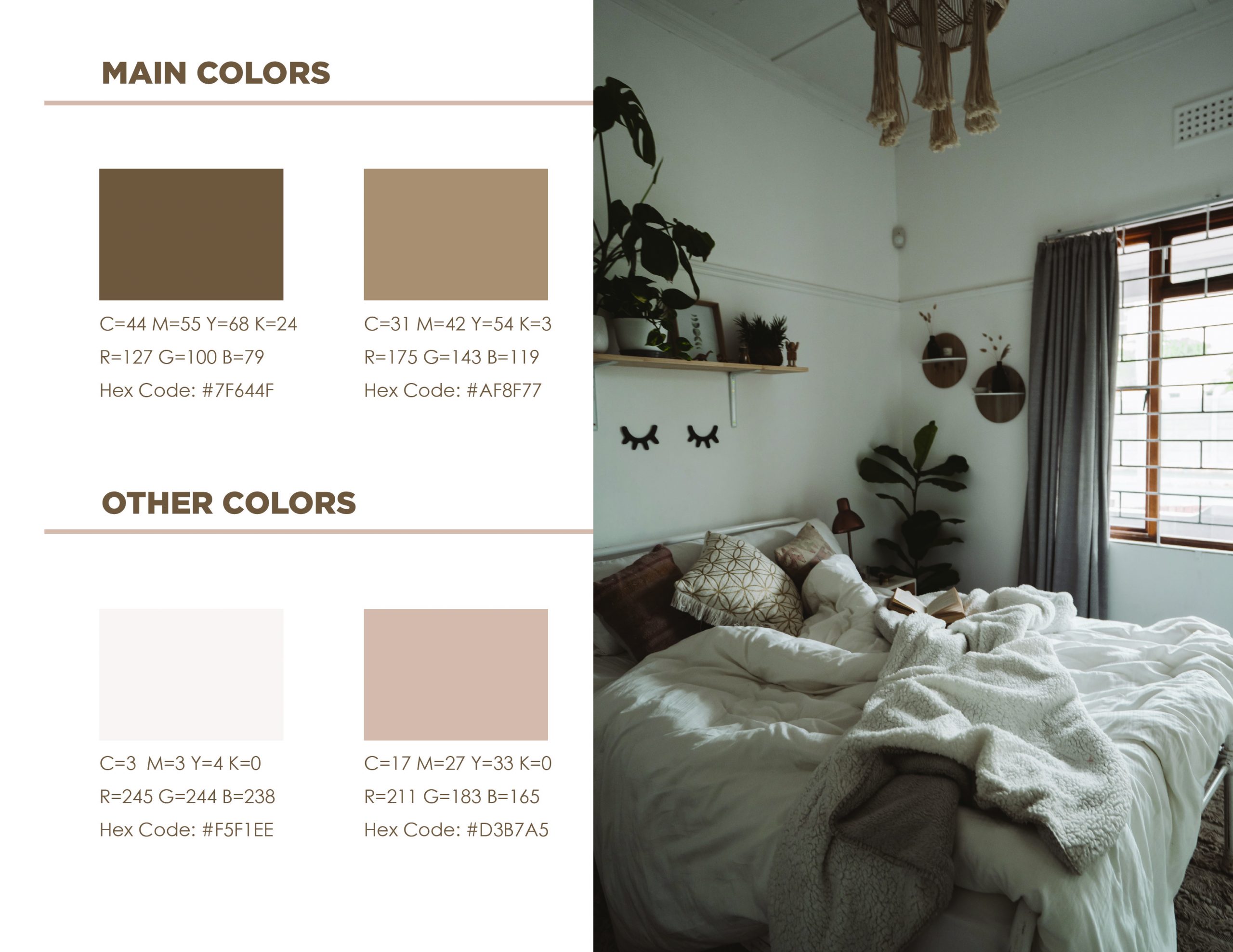
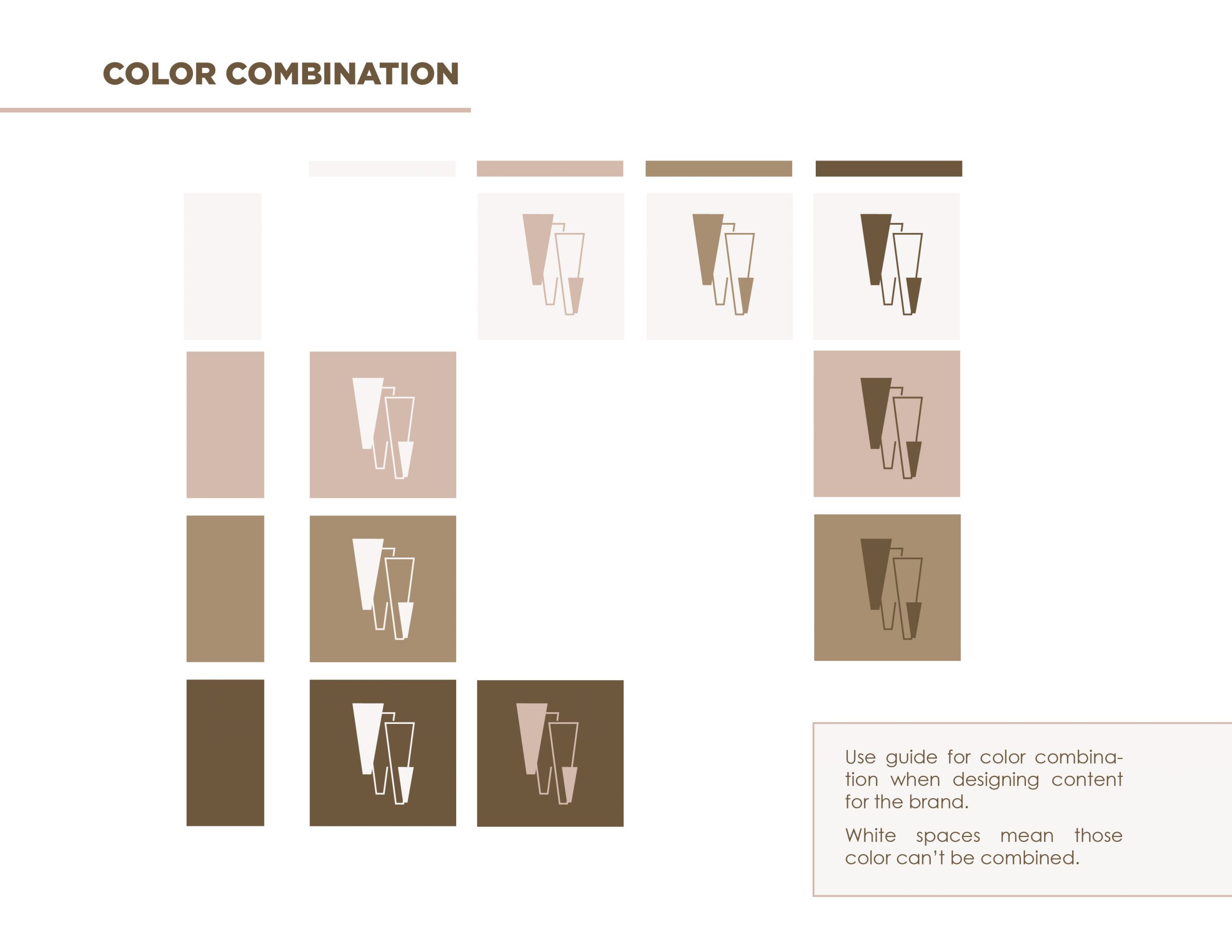
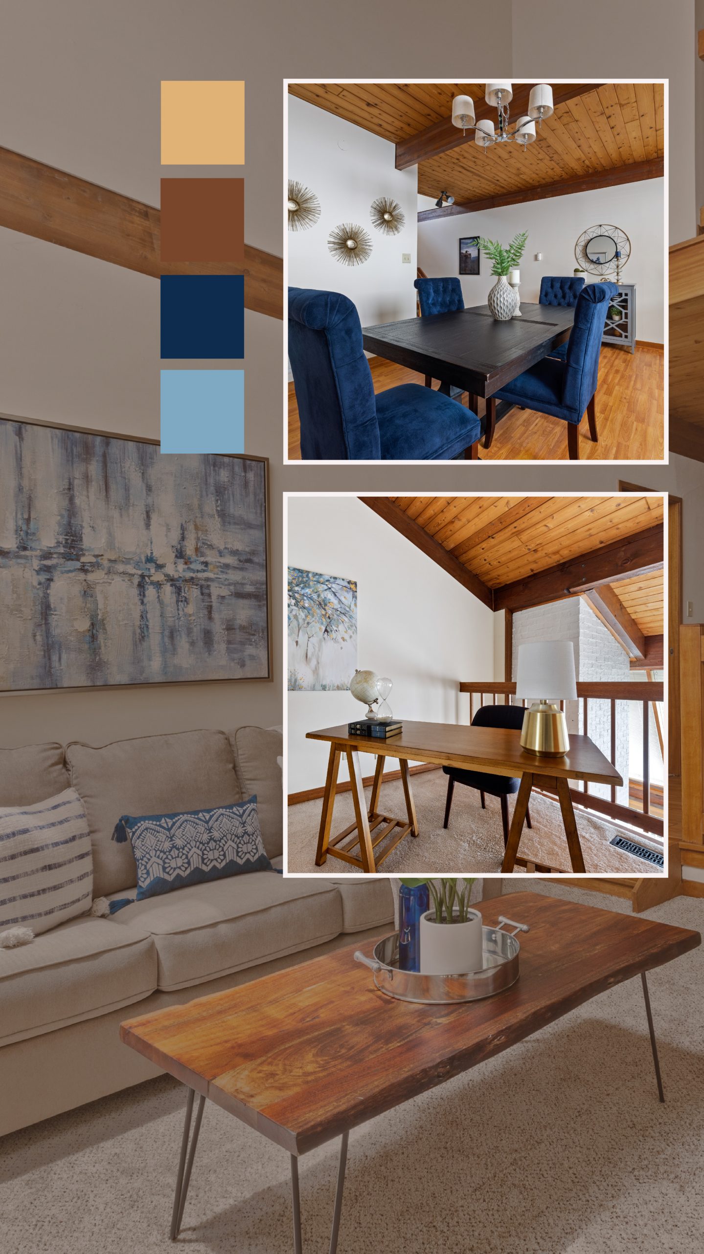
These two along with simplicity will be the general creative concept of the project. The palette color will be based on the neutral colors taken from the mods board, focusing on a variety of browns.
Logo Concept
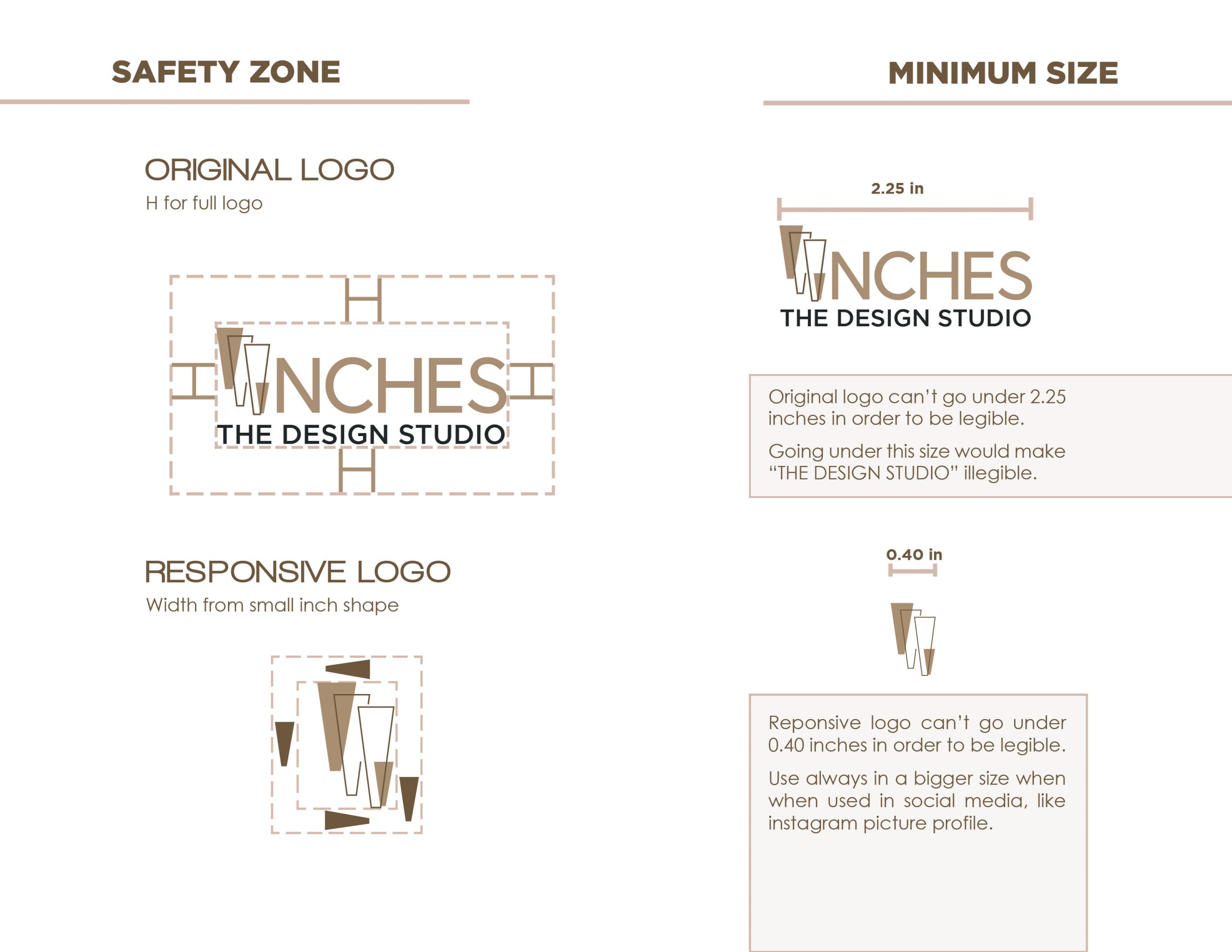
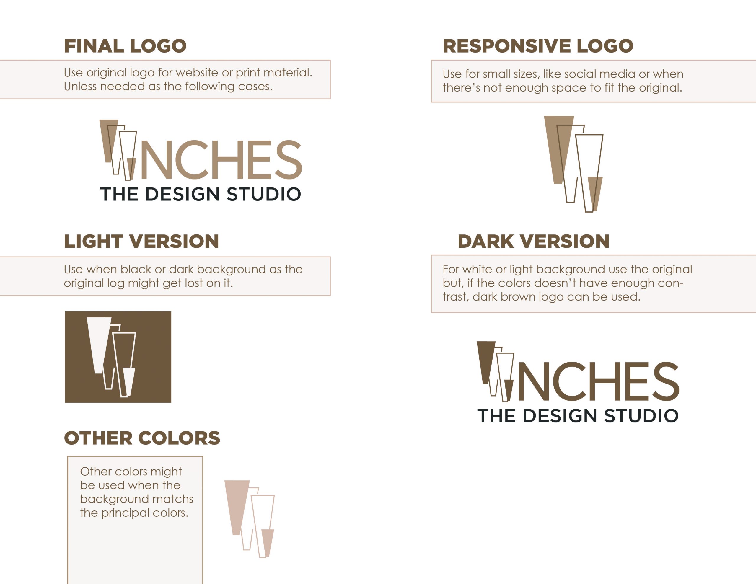
For the logo, the idea was based on simple lines, geometric shapes, and one or two colors. This makes the design look very clean and easy to recognize.
As the icon for an inch is a geometric shape, the main idea is to develop a logo that refers to the name of the company so it can be used individually and still be recognizable. On the other hand, the name needs to be written with a sans serif typeface as it’s going to be used mostly for web. It will still need to follow the geometric idea to match the logo.
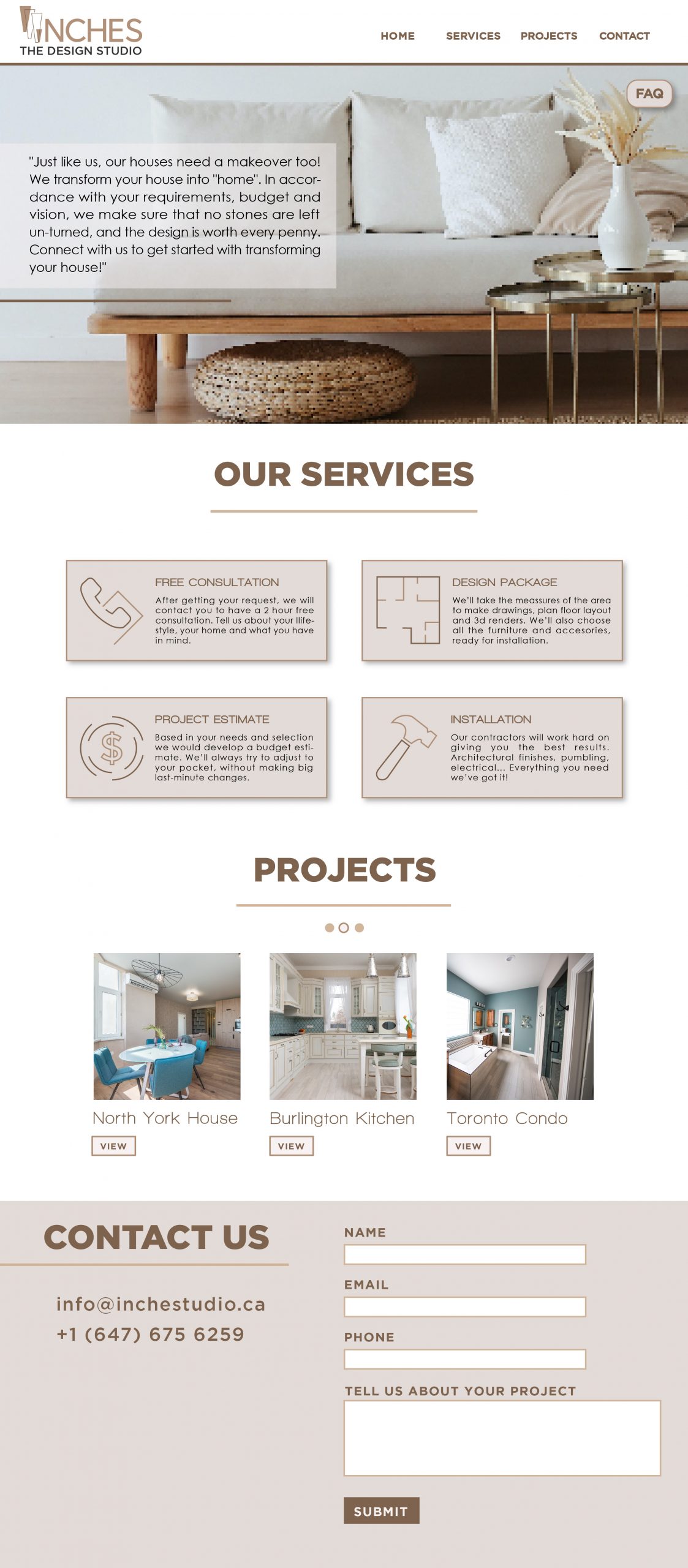
Website Concept #1
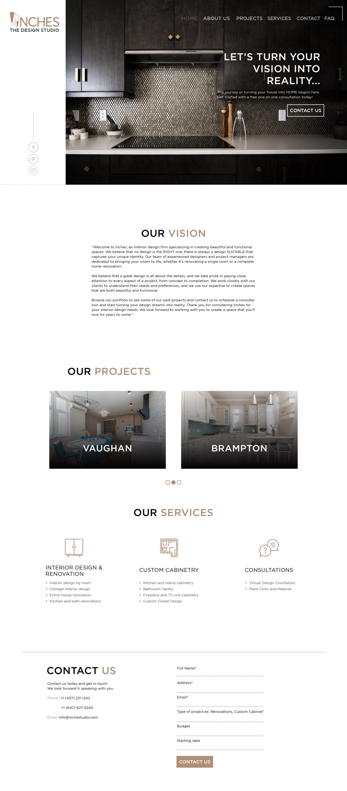
Website Concept #2
Website Concept #1
Website Concept #2
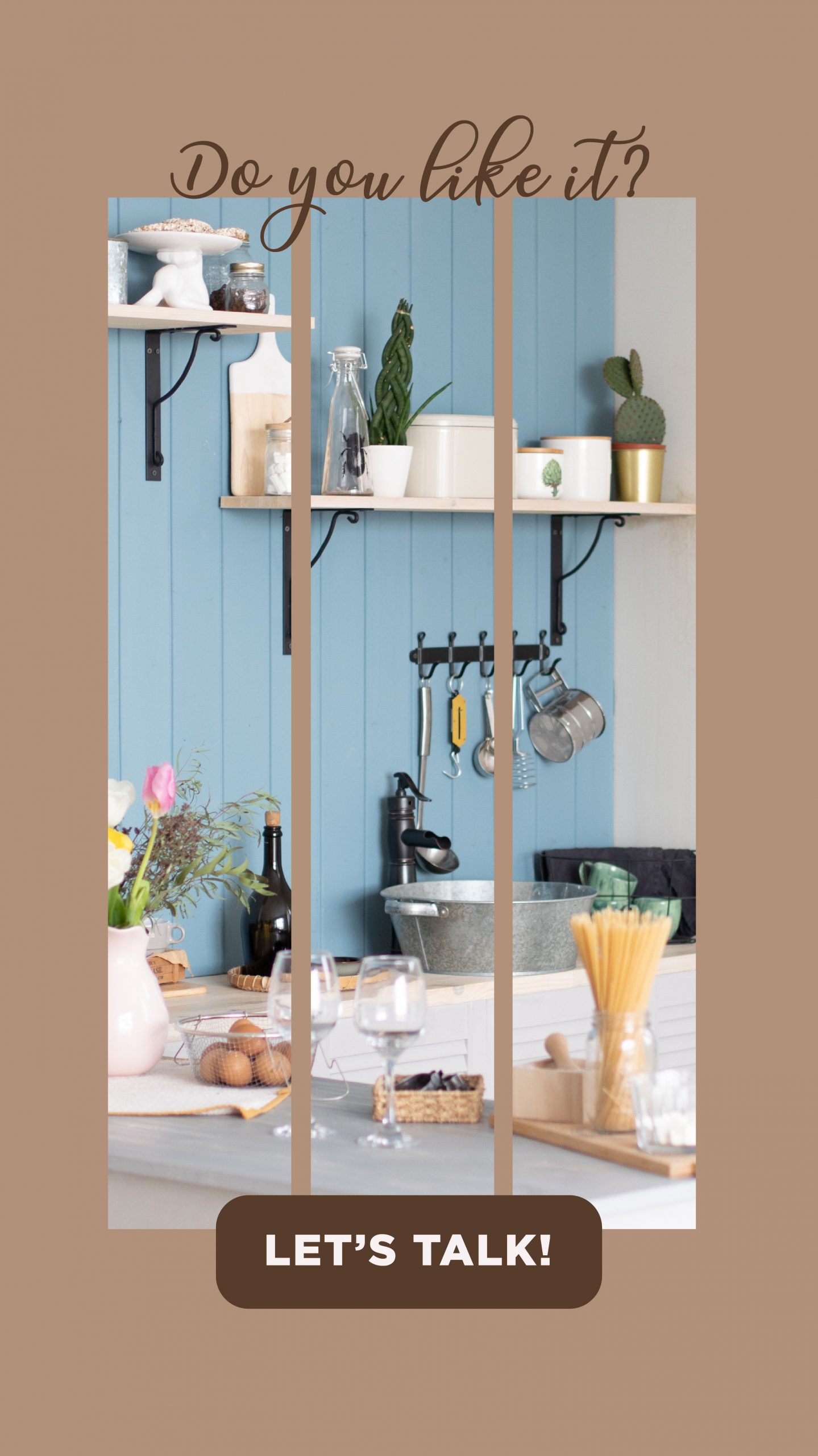
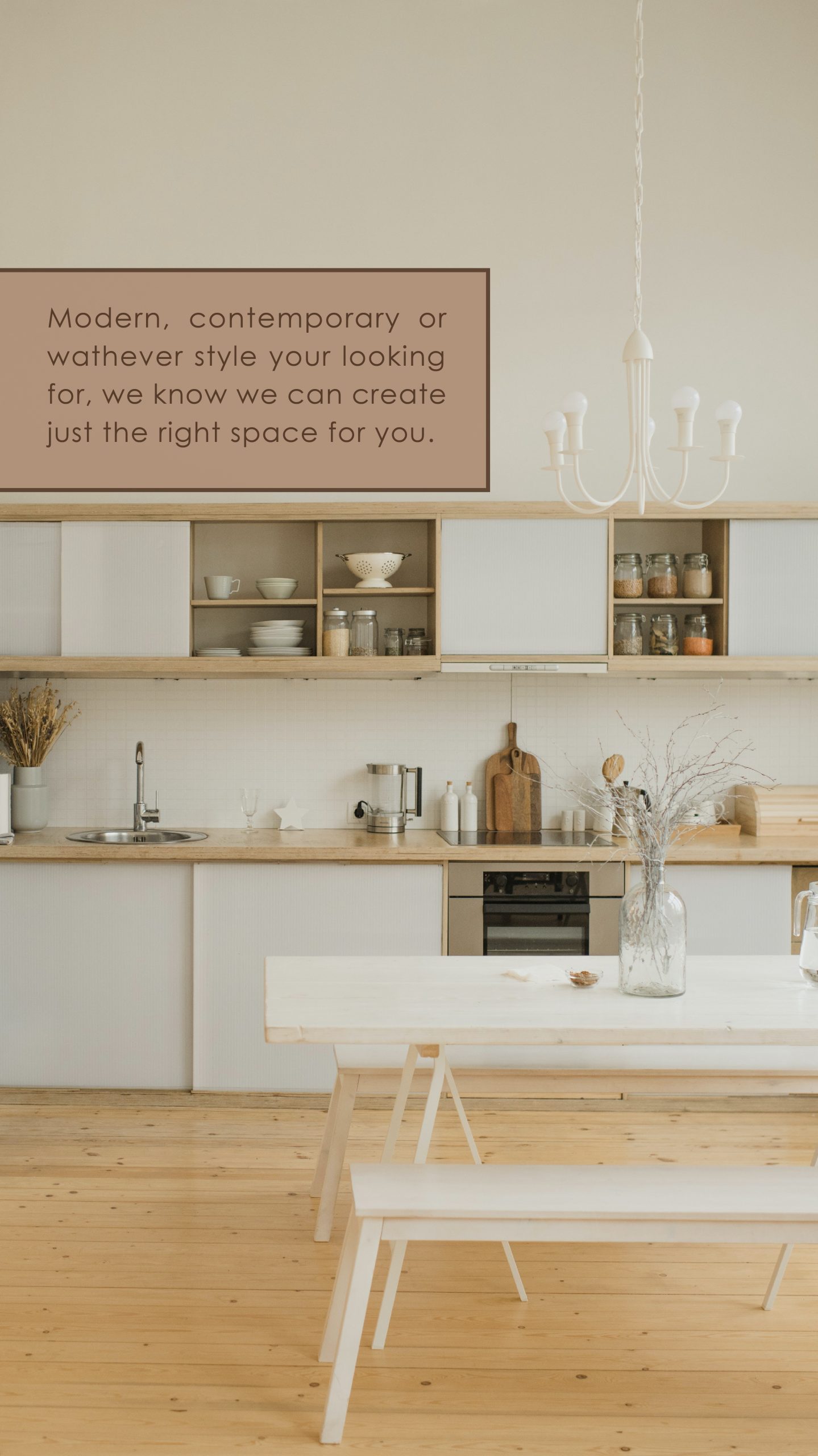
Social Media Concept
Following the same concept, the idea for social media is to display the different projects, quotes about interior design, and pictures of the products from the shop, as they will open it on Instagram to get more people to buy, not just the actual clients they have.
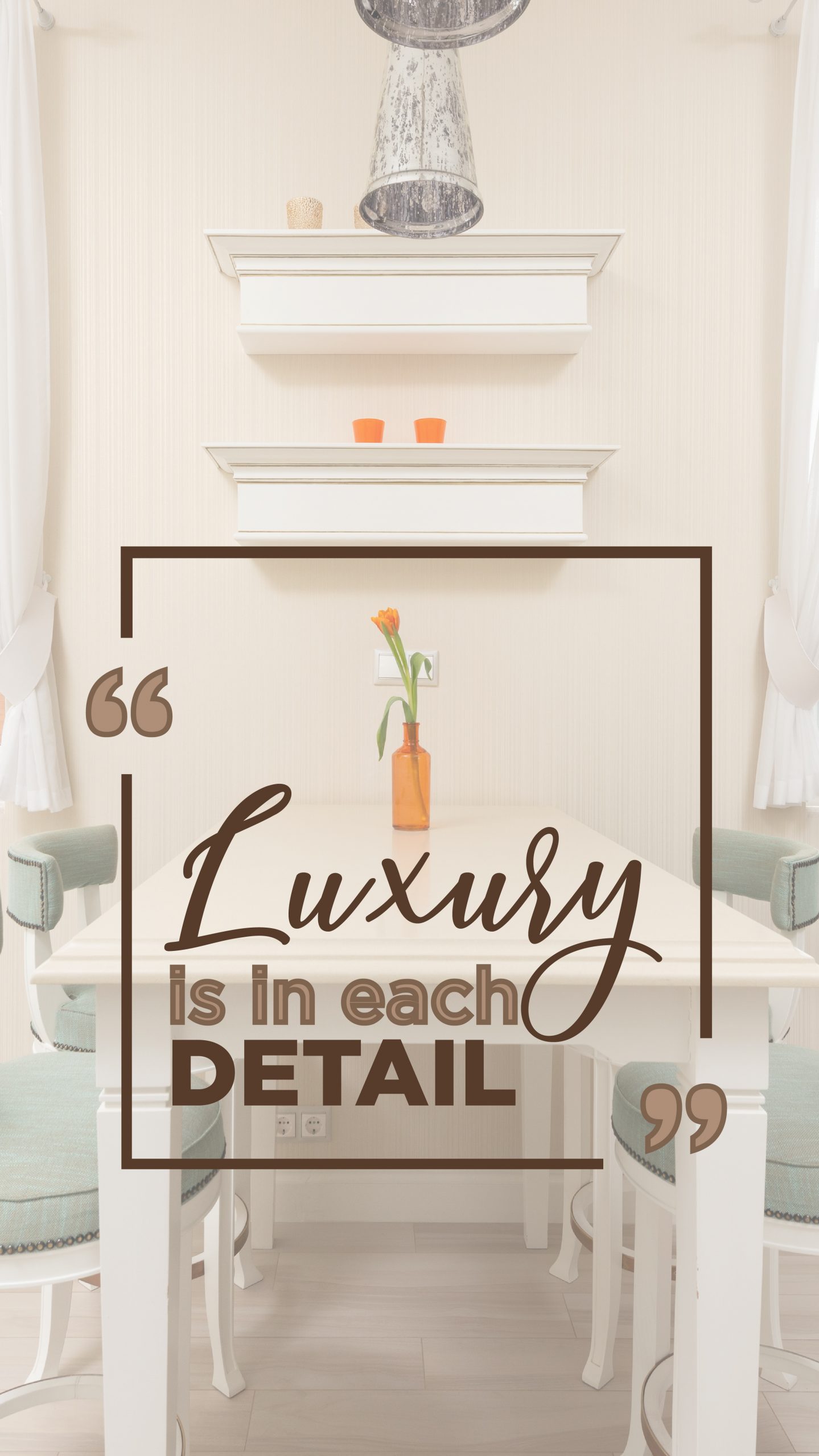
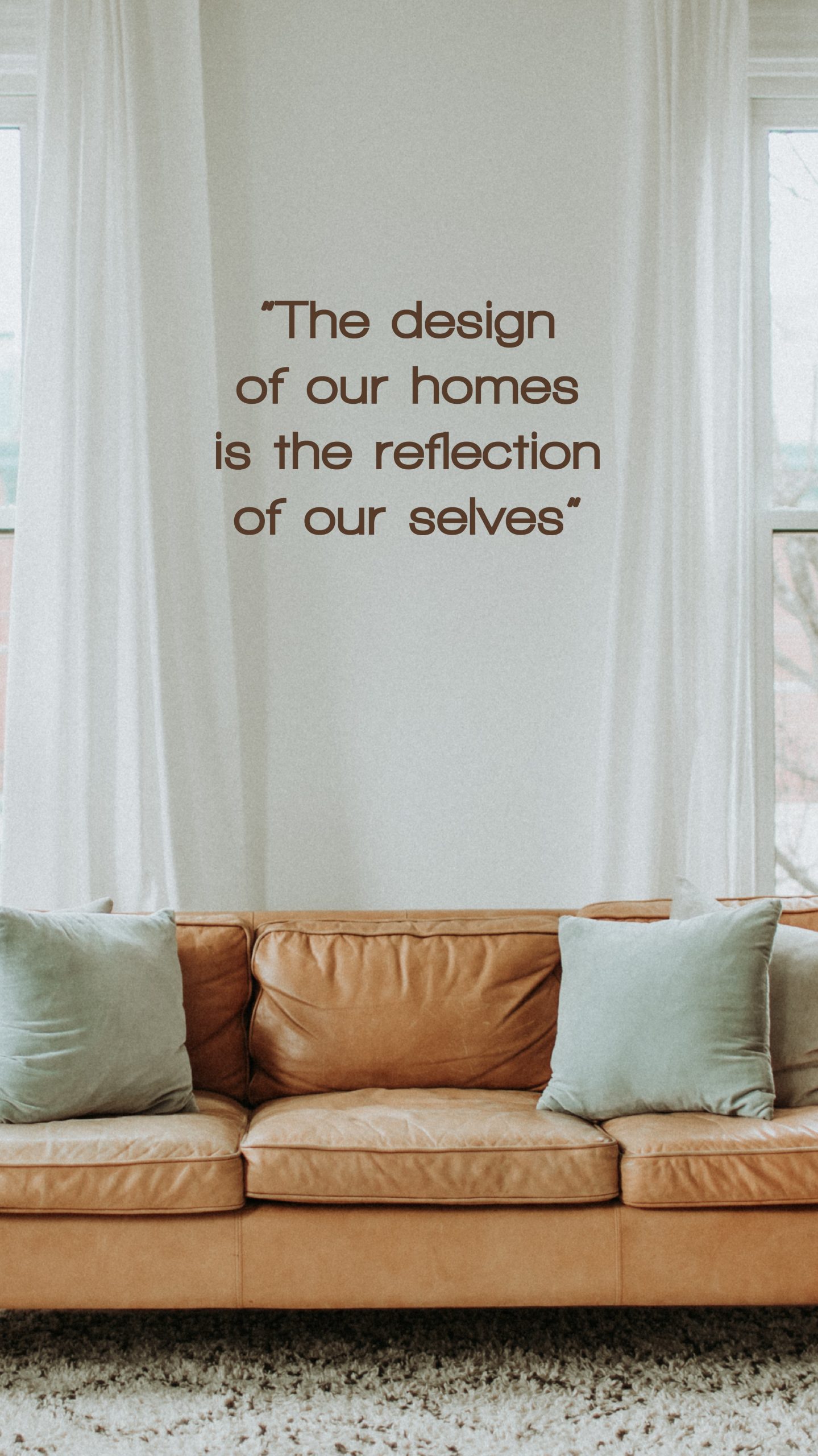
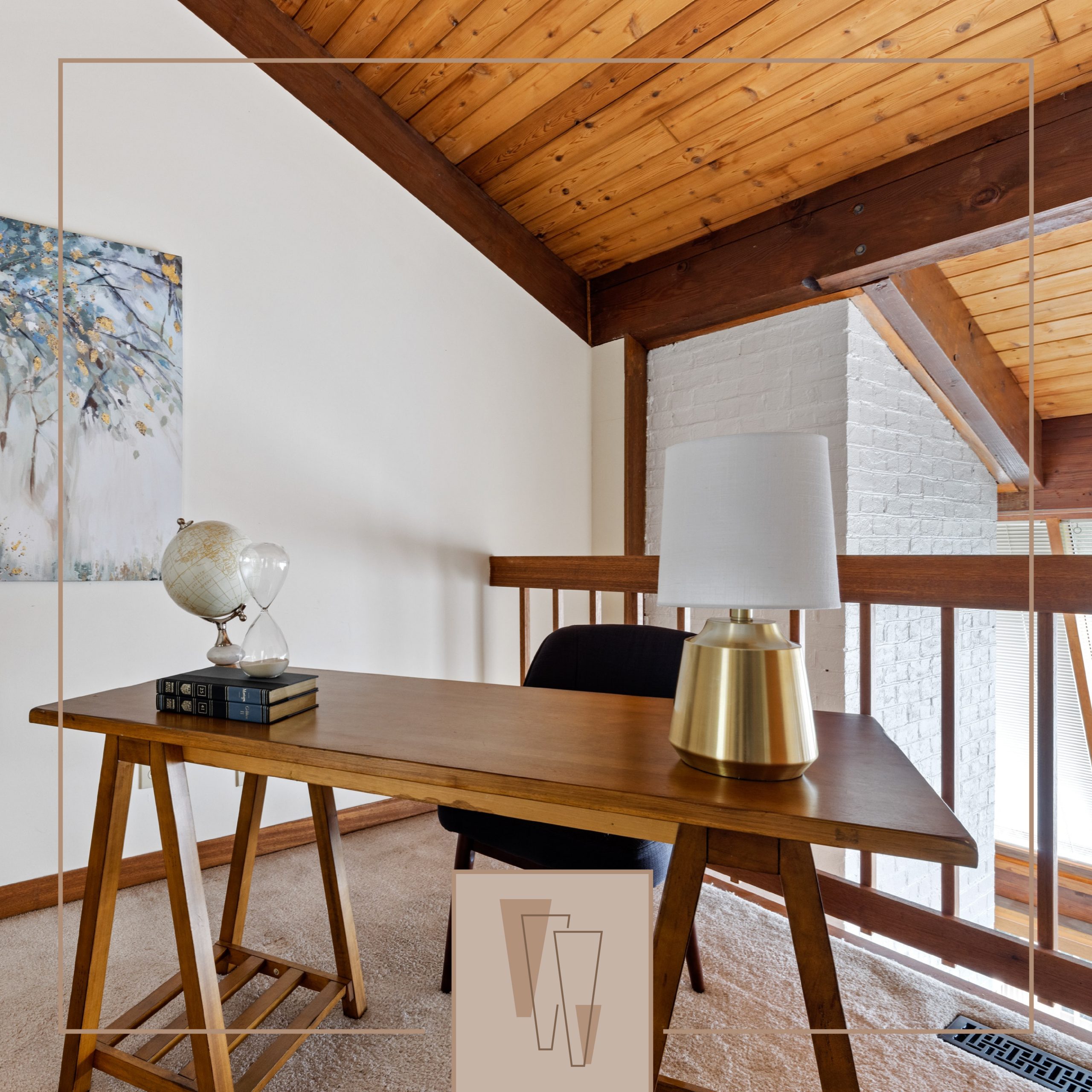
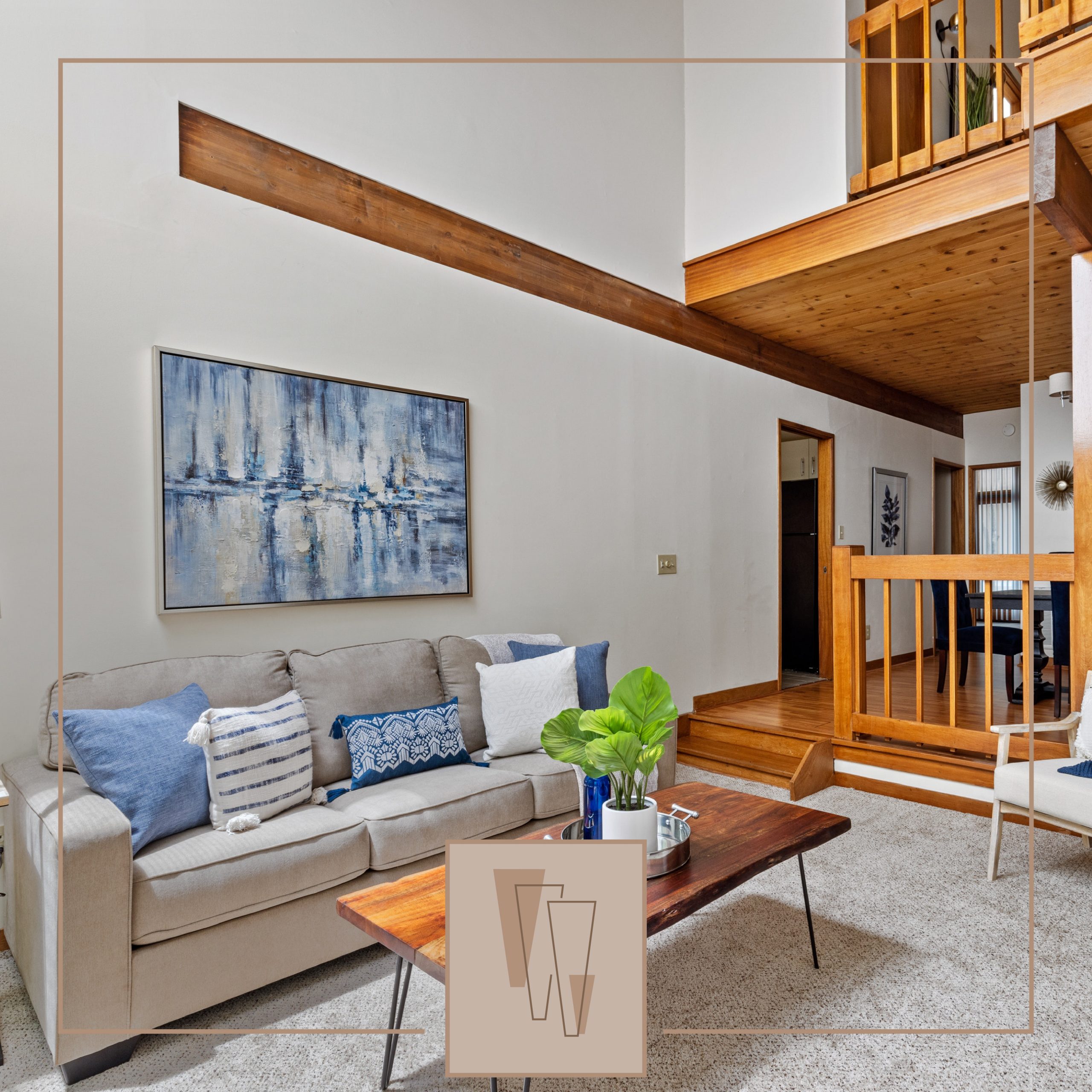
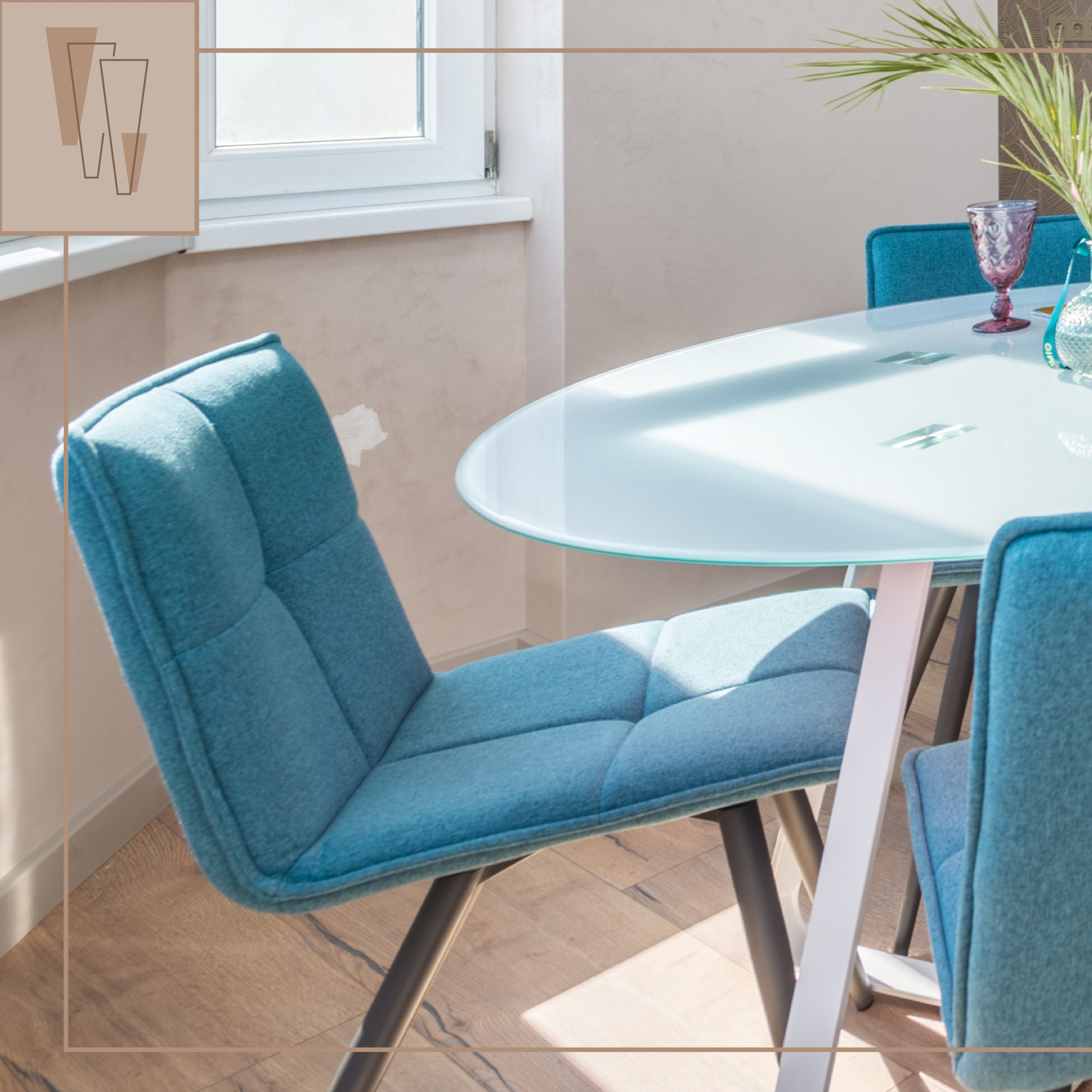
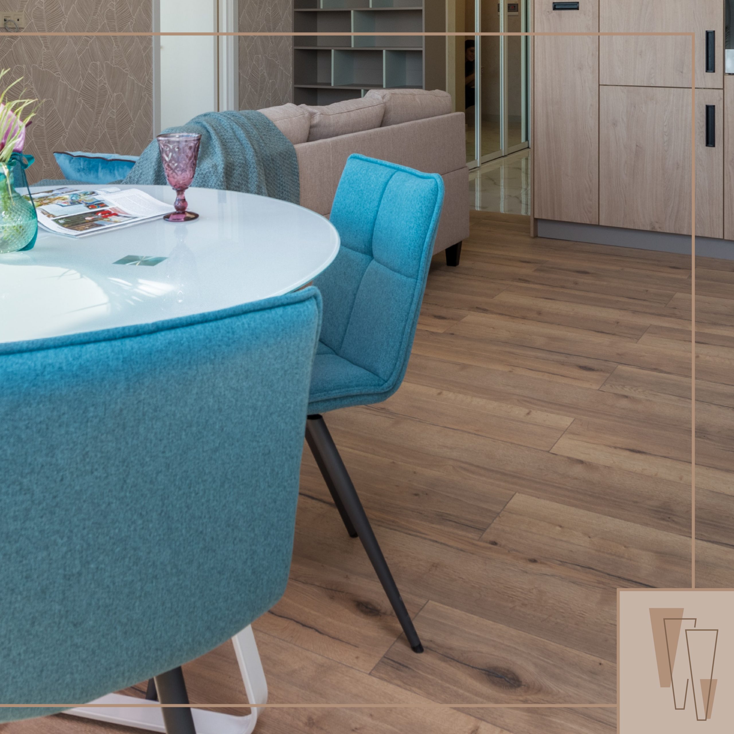
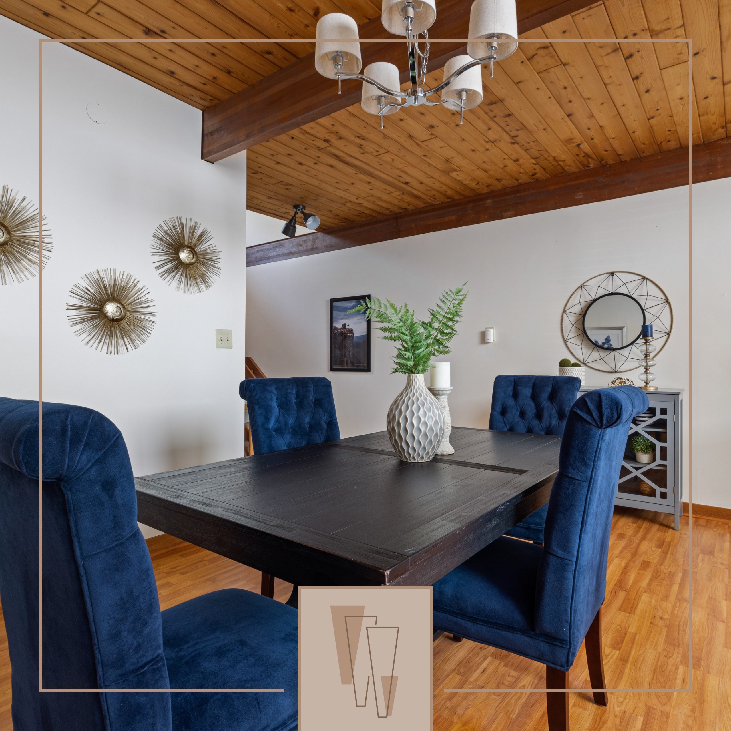
Pictures of projects: All brown colors. Thin stroke of a square with the logo at the bottom.
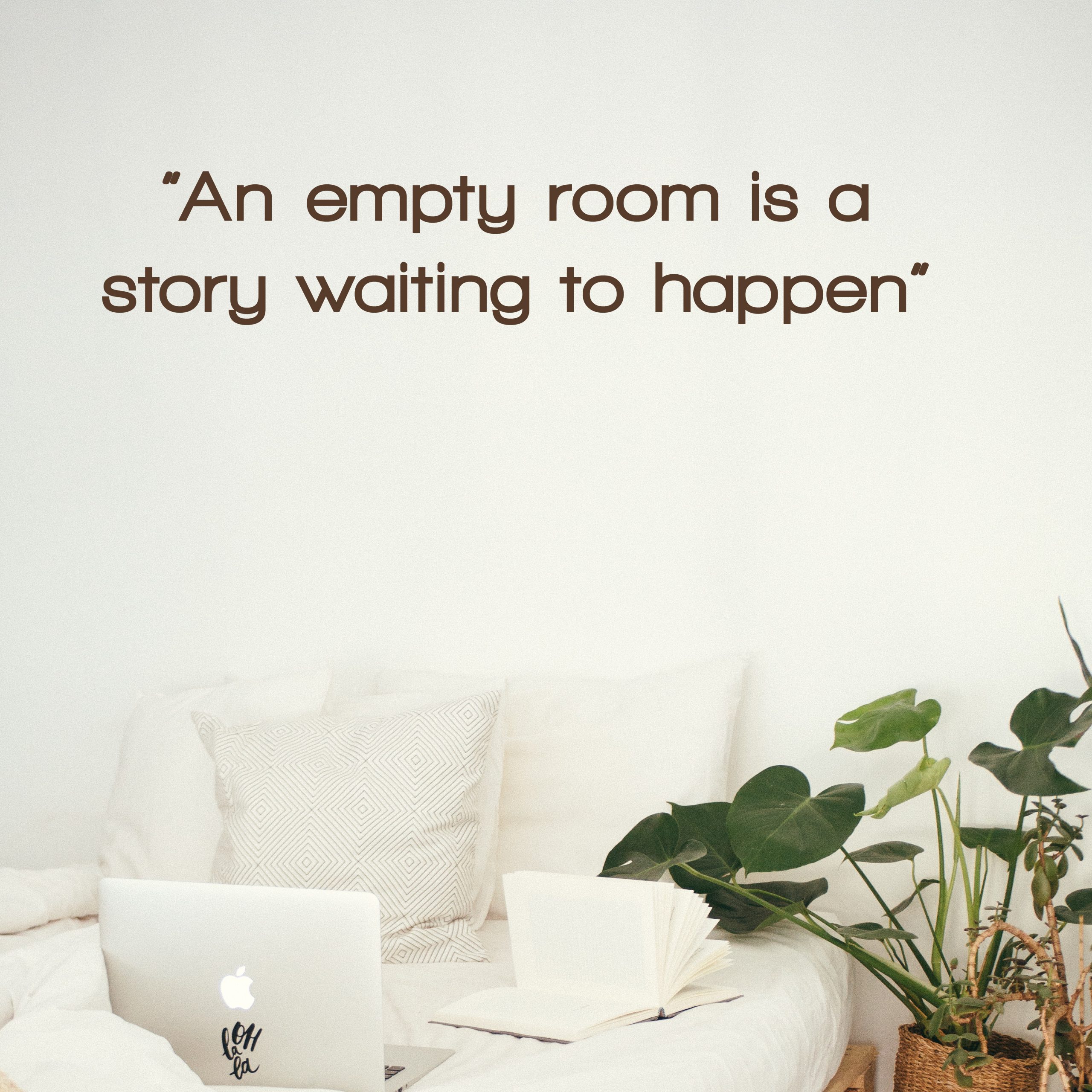
Quotes: Pictures of projects but with quotes about interior design.. Brown colors to create contrast between pictures and get a clean look at the different concepts. The quotes help to show the tone of the company.
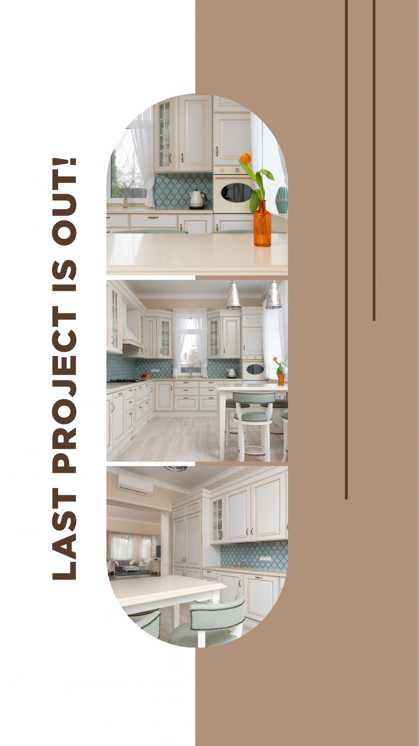
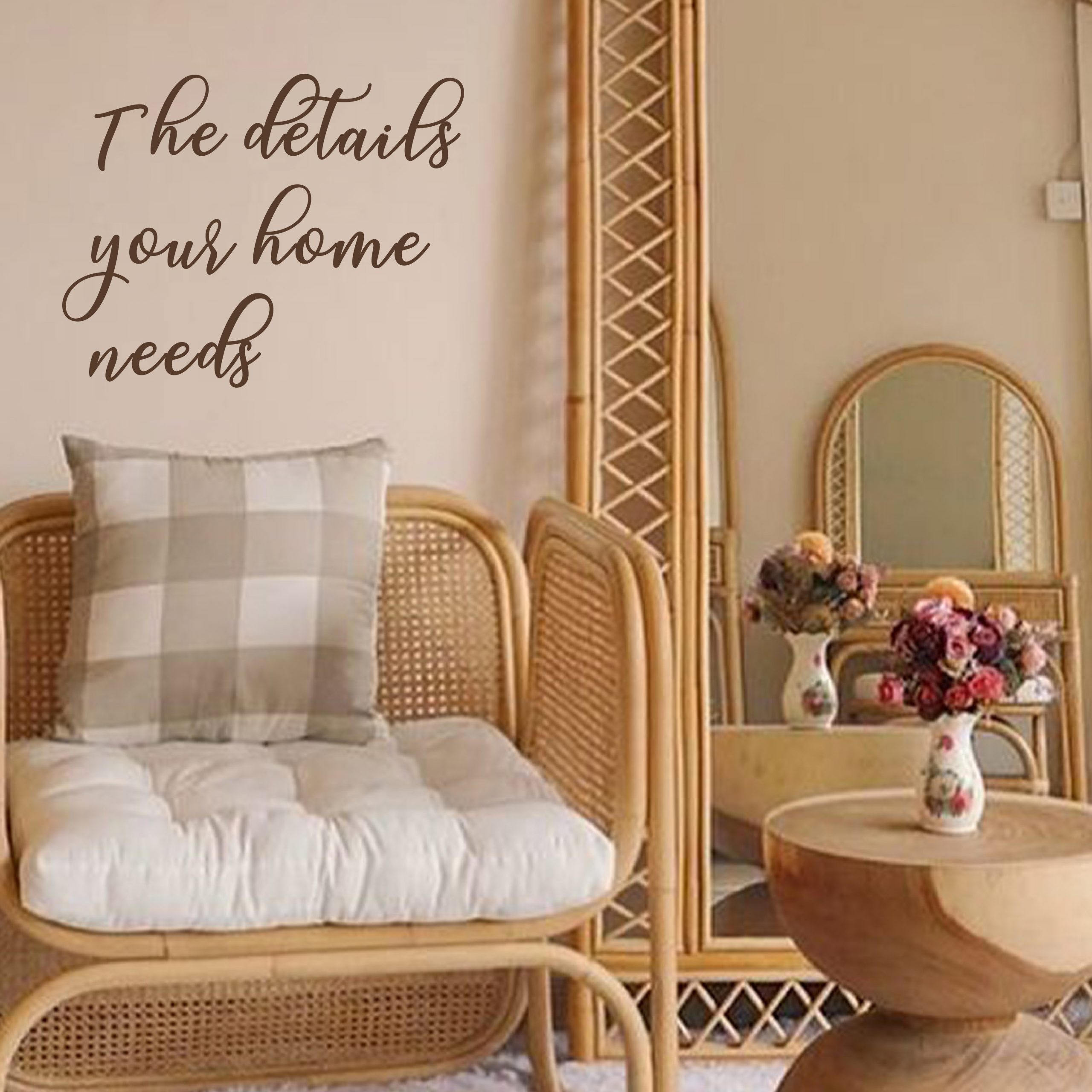
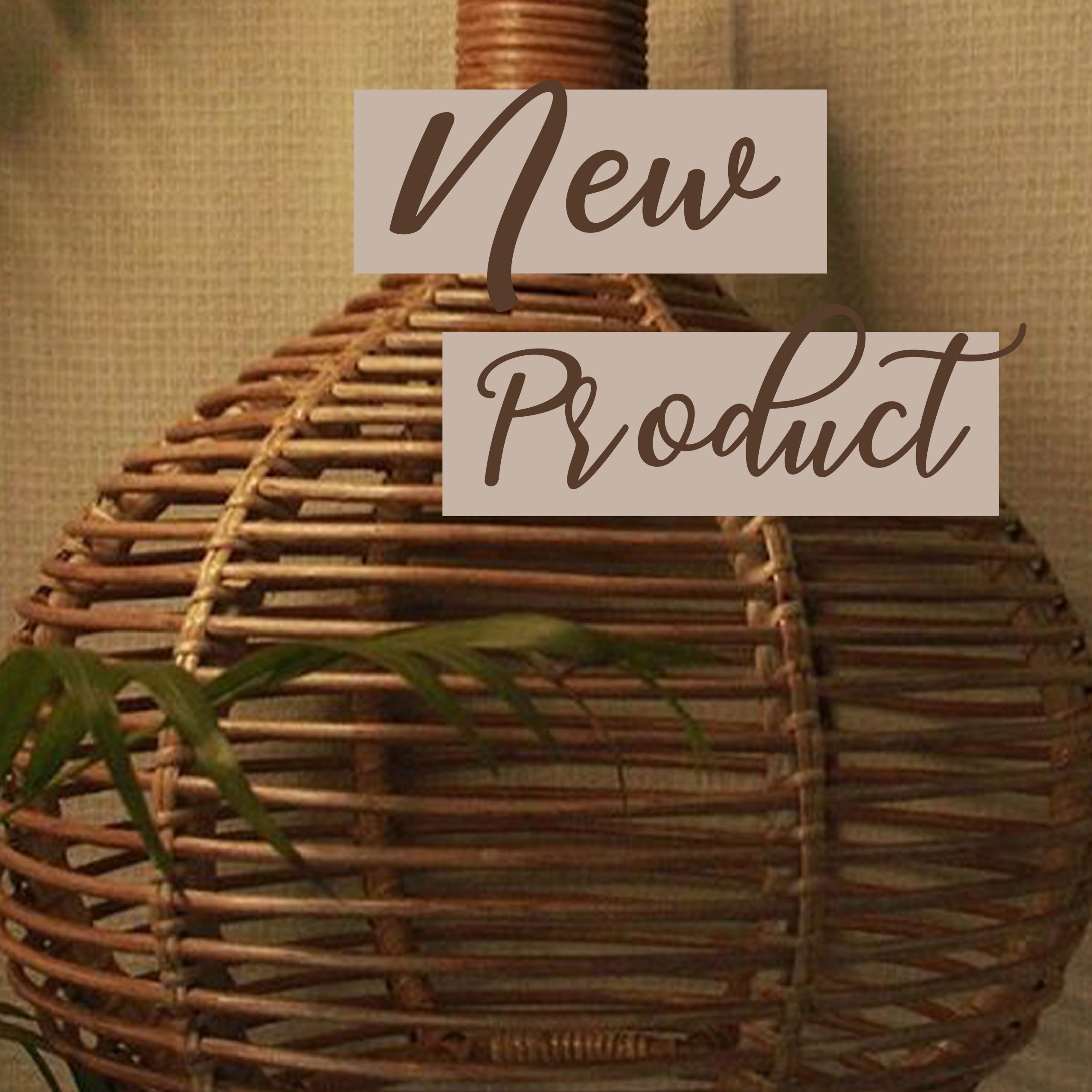
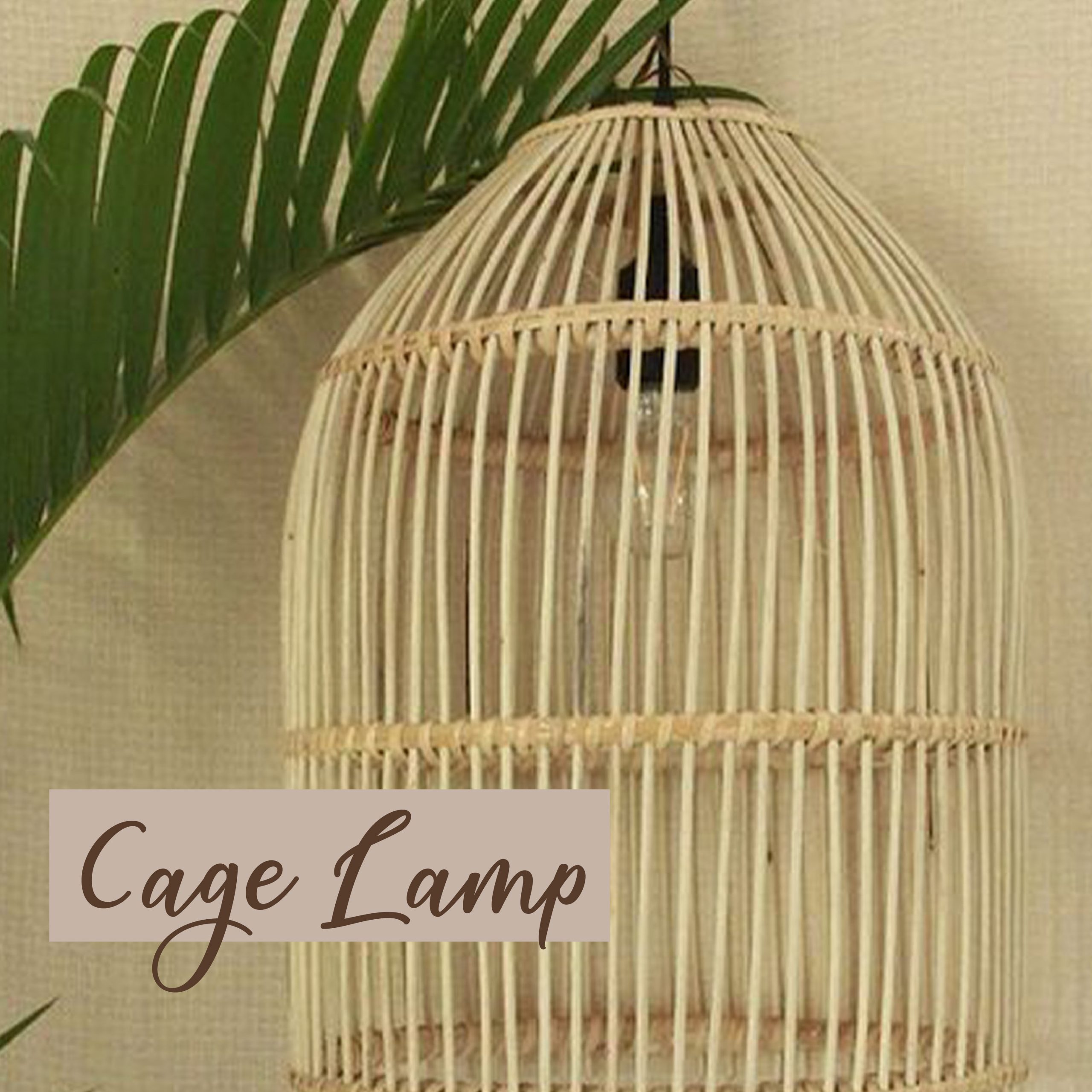
Store: Big letters with pictures where the product is the focus. Also can be used with quotes that appeal to details on the design.
Stories: It will be designed to fit in different pictures, like a gallery, with different styles, to show the client more than one picture.