Nonna’s Cook is an Italian–Canadian meal kit service that offers weekly plans for people who don’t have time to cook or don’t know how to cook, or even if they just don’t want to cook.
Their plans go from one person to a whole family. Includes plenty of variety such as kid’s friendly meals, vegan plans, gluten-free plans, quick-to-prepare, or low-calorie plans.
Their food is based on a fusion of traditional Mediterranean cooking with other cultures, such as Asian or Indian. We want people to get that feeling when you’re eating your grandmother’s meals. We want to be everybody’s nonna (grandmother in Italian).
Creative Strategy
While competitors stick to simple typography and a little icon for their logos, we want ours to be clean, timeless, and able to roll with the trends. That’s why we’re going for a bold, all-caps font to make a statement and stand out from the crowd.
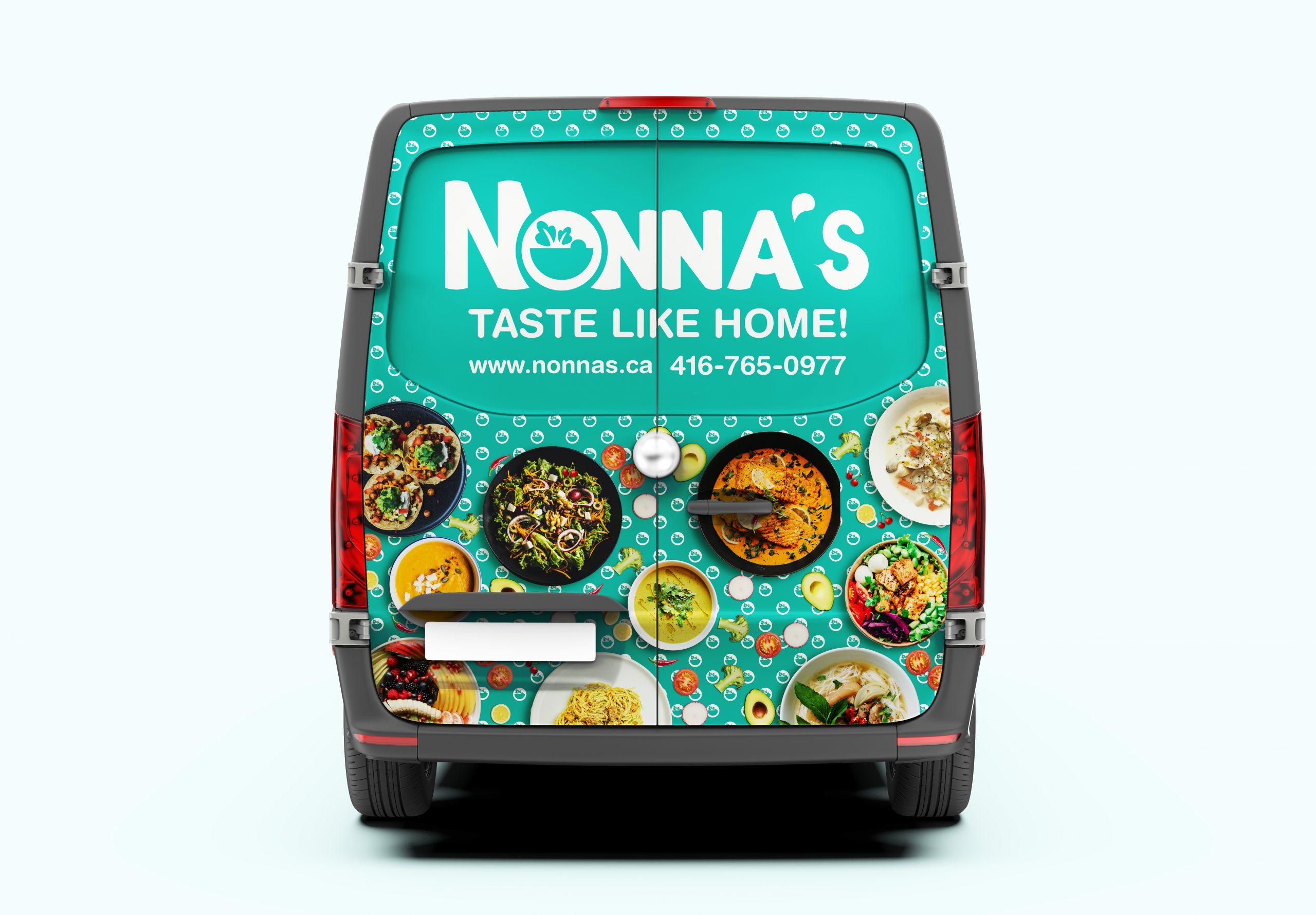
Our big idea is to merge our name and icon into one slick logo. Picture this – the ‘O’ in Nonnas isn’t just a letter; it’s got a bowl inside, doubling as our icon. Smooth, right?
Throwing a couple of ‘N’s around that ‘O’ isn’t just for looks – it keeps things flowing and gets rid of any harsh edges. Plus, we rounded off all the corners for that chill, friendly vibe.
Now, let’s talk colors. We went for a laid-back palette that’s all about closeness, tranquility, and health – basically good vibes in a nutshell. It’s bright enough to bring some joy but not too in-your-face.
And that salad bowl? It’s not just a pretty picture; it’s shouting out our love for healthy, organic, and eco-friendly vibes. It’s like our way of saying, “We’re all about that fresh, green life!”
So, in a nutshell, our logo’s the perfect blend of trendiness, friendliness, and a nod to our love for healthy eats. Nonnas, keeping it real and tasty! 🥗✨